Eleria
The Brief
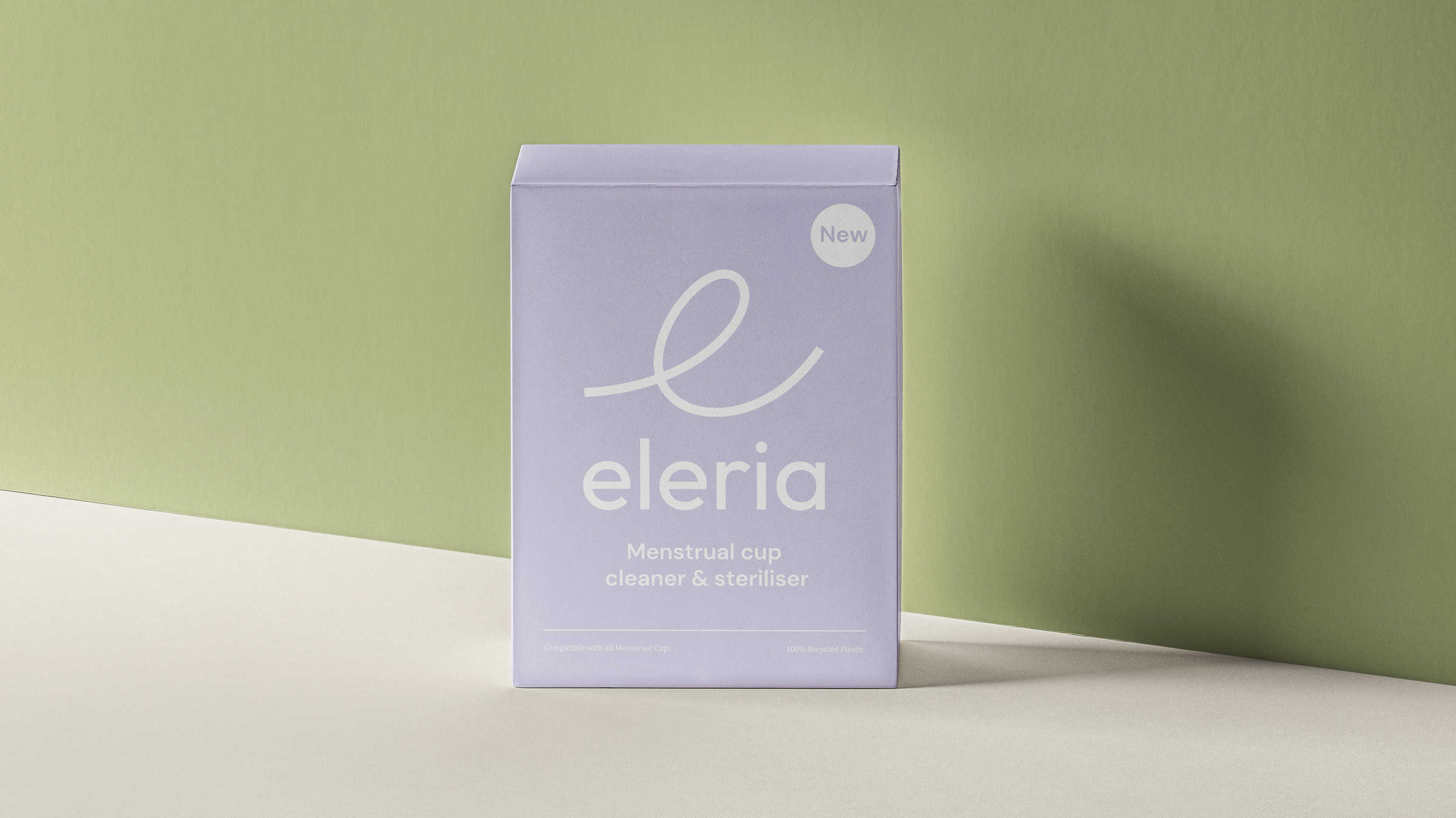
Eleria is a portable cleaner and steriliser for menstrual cups that needed a signature look
to kick start its launch.
Sectors: Start-Up | Branding | Campaigns
Services: Design | Animation | Illustration
Eleria approached us for a rebrand, and a ‘How to…’ animation, introducing their product to the Menstrual cleaning market. Working with its founders we crafted a unique look to their brand, that focussed on colour to help introduce Eleria to the world.
An Overview
Sleek, timeless, appealing & functional
Deliverables:
- Branding Design
- Brand Guidelines
- Illustration System
- Iconography
- Hero Animation
Eleria’s founders Kira and Monica created a product that was both necessary and desirable, a sanitary product that was focused on function, but also looked sleek, timeless and appealing. They came to us with a fully fleshed concept for their product, but no branding design, that’s where Meantime stepped in.

Research & Strategy
Brainstorming names, market research and investor feedback
We worked closely with the founders, taking in consideration their market research, highlighting their desire to focus on a European market. Our strategy was focused on designing their brand to stand out amongst a small pool of competitors, making sure their product stands out and hits their brief. Colours and illustrations were our key priority, balancing fun, with cleanliness and avoiding cliché visuals associated with feminine hygiene products.
This is how we did it
Brainstorming names, market research and investor feedback were all key to how we kicked off our Eleria brand journey. Once the name ‘Eleria’ was decided and the logo was finalised, we developed an animation (the main asset in our clients brief). Inspired by the loose flowing ‘e’ in the brands logo we developed. This went on to influence the brand’s illustration style, iconography and colour palette.
The Outcome
Spotlighting hygiene innovation with pastel colours and illustration heavy branding
The outcome of the branding design was a bold but pastel, utilising plenty of illustration, complimentary fonts and a fluid logo. All of this is paired with a fun, Gen-Z focused animation on how the product works.
Credits
Design
Brogan O’Grady
Conner Perry
Illustration
Conner Perry
Brogan O’Grady
Animation
Conner Perry
Penny Goodhand
Produced
Brogan O’Grady
Produced
Brogan O’Grady
Sound
Luke Billing
Production Year
2023
Special Thanks
To Kira Goode & Monica Wai
Related work
PEEQUAL
‘How To Use a PEEQUAL’