Rebrand
Meantime Studio
The Brief
Reflecting who we are with a fresh brand direction
Sectors: Creative | Marketing
Services: Branding | Design | Identity | Animation
Our Approach
Meantime Studio – A rebrand to reflect who we are as an ever-evolving creative company. Striking a balance between the fun and the polished, we wanted to create a unified brand that’s flexible and allows our work to shine!
We’ve crafted a flat, simple logomark resembling the letter ‘M’ of Meantime in a bold, highlighter yellow. We said goodbye to the intricate details and warm tones of our old brand design With its sheared design, our new icon is chunky, dynamic and full of motion. Plus, it’s completely symmetrical and scalable.
Brand System
We’ve built an identity that seamlessly links every aspect of our brand. Inspired by the harmony between the raw and the refined, this identity flows through each element, from the bouncy curves of our logomark and illustrations, to our punchy flash-photography, font and motion principles.
Typography
We chose DM Sans as Meantime’s primary typeface – used for our wordmark, it’s rounded, geometric and clean. To mirror our approach, we’ve shaked things up by using italics to call out keywords.

“Meantime listen closely and have the ability to turn a relatively loose brief into something both visually arresting and highly informative. We could not recommend Meantime any more highly, and look forward to continuing to work together in the future.”
Susie, The Trussell Trust
Communications
Making space to be creative while having consistency across the board
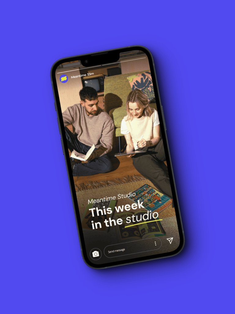
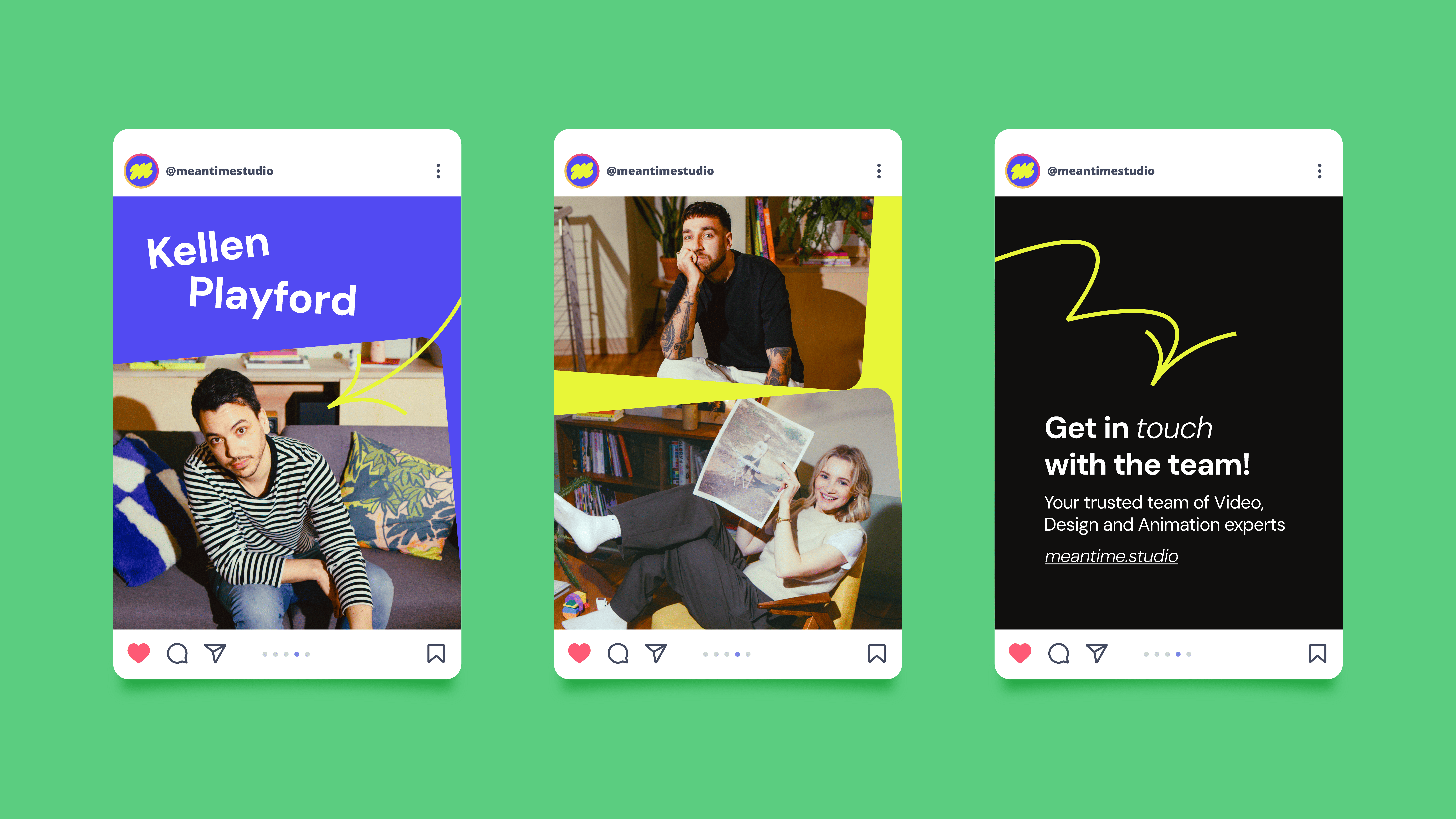
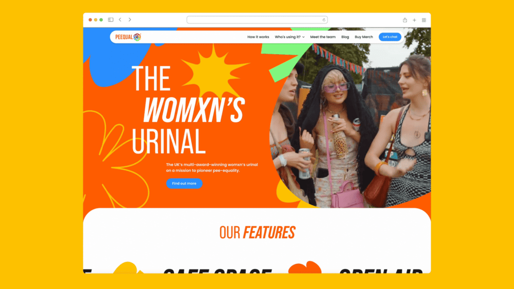
Our new brand design better supports our digital presence. We’ve developed a full range of brand assets, social media templates and motion toolkits. Making room to play while keeping things consistent across our website and social media. We use the “m” shape as a mechanic for masking, creating patterns, graphic dividers and more. Additionally, we’ve incorporated the fluid movement of our logomark into our brand arrows, which have been animated for social.
The Outcome
Through a simplified logomark, a bold core colour and a flexible design system, this rebrand makes room to have fun and be creative while maintaining consistency and reflecting us better as a creative studio.

Credits
Creative Lead
Brogan O’Grady
Senior Designer
Conner Perry
Animation Lead
Alwin Ediagbonya
Animation
Jack Purling
Alwin Ediagbonya
Web Design
Brogan O’Grady
Conner Perry
Web Developer
Ben Baker
Photography & Director
Joe Murray
DOP
Tom Cowles
Copywriter
Lindsay Michiels
Special Thanks
To our creative director, Joe Murray and our managing director Luke Billing.
